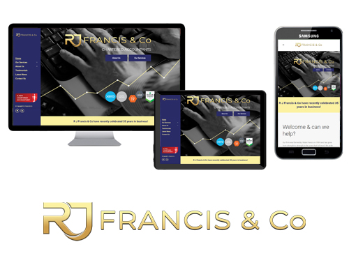
After meeting Sarah at one of our workshops, we we’re given the opportunity to redevelop the RJ Francis & Co website. The website was developed to stand out. To be different from everybody without compromising functionality. We opted for a vertical fixed menu on the left side of the website (on desktop & tablets) which works really well. The website was branded in line with their logo – gold and blue. Above all, both we & the RJ Francis & Co team are pleased with the result!
Call Us: 01432 607 660
Email: info@thedmlab.com


