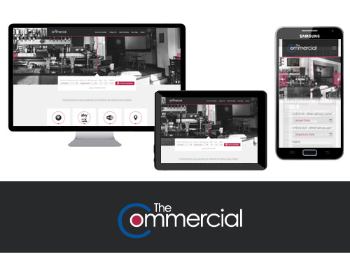
The popular ‘Commercial‘ asked us to create a website promoting the pub but mainly the accommodation side. Choosing red from the logo as accent colours we developed the site to both make booking as easy as possible and to promote Hereford itself as a place of interest to encourage people to visit and stay over. We think it’s a really cool site. What do you think?
Call Us: 01432 607 660
Email: info@thedmlab.com


