How We Have Built Brand Consistency
Our brand (and brand consistency) is the story that connects you, the people, to the services we offer. As a design and digital marketing agency, we like to thing we do things well. We like to think we do things properly too! We’re not sure how engaging digital marketing is to Joe Public, that’s why we mix up fun stuff with work. Add to this stuff we get up to outside of work…because of work!
We read this awesome blog featured on 99Designs https://99designs.co.uk/blog/web-digital-en-gb/build-brand-consistency/ and it’s always nice to be reassured we’re doing things well and doing things right when it comes to our brand consistency and how we build it.
We checked the boxes in our heads while we were reading. Which got us to thinking. Let’s tie a blog of our own into it. This one! So, here goes…
![]()
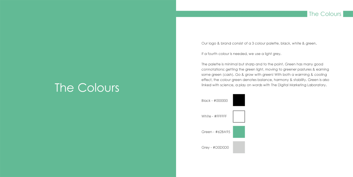
Our brand is pretty simple. We produced some branding guidelines when we rebranded back in 2014 and everything is still current to this day. We’ve fused brand consistency into our website design. When you land on our homepage you’ll be met with familiar fonts, colours and distinct shapes. Those shapes being squares, a fundamental part of The DM Lab’s logo. It all ties in in an uncomplicated, neat way.
Our primary colour is a shade of green. If you’re familiar with our brand, you’ll recognise it. It’s a simple flat colour, which we add a slight gradient to in our logo (see above).
An extract from https://www.fatrabbitcreative.com/blog/psychology-of-the-color-green-and-what-it-means-for-your-business states the following:
The color green has a wide range of visual and mental associations, a fact attributed to its use in many phrases and expressions (think, “grass is greener,” “going green,” “getting the green light,” etc.). Another contributing factor is that green takes up a larger portion of the spectrum of colors visible to the human eye than any other color—meaning one type of green can have totally different associations than another. For example, a dark forest green can become very manly, traditional, and calm, while lime green (think Gatorade) has a high level of energy. These natural greens, from forest to lime, are perceived as tranquil and refreshing. You may have noticed that all these associations have one thing in common: green has an overall positive message.
When we rebranded, we considered all this and nothing was ‘winged’. Every tiny detail was explored and everything had a reason and a purpose. Also from the same site is this line:
Green is known to help alleviate depression, nervousness and anxiety
Sometimes people are unsure about our services because there is no tangible end product. We hope our brand puts them at ease then after some communication they feel confident to work with us.
We also are big advocates of whitespace, especially within our own brand. Again our website is a good example of this. We love this quote from the 99Design blog…
Fusing this design technique into your site actually boosts attention spans and comprehension rates by 20%.
See, we know what we’re doing! Moving onto the fonts…
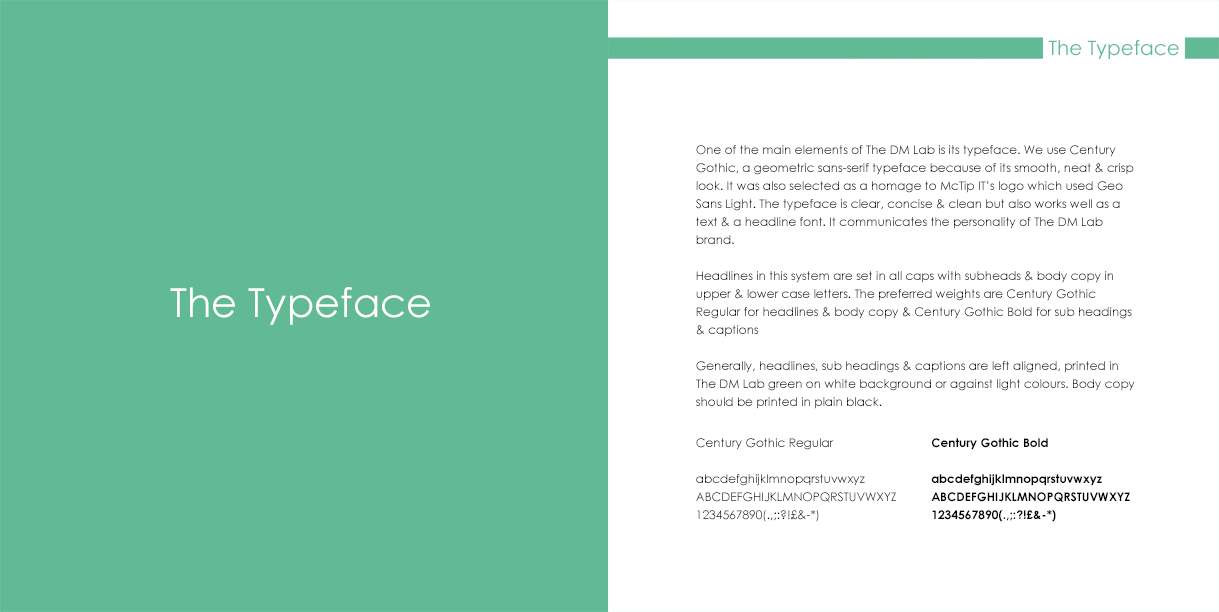
Our font (Century Gothic) is simple. Neat. Crisp. It’s in our logo and throughout our literature. Very legible. The Google font equivalent (pretty much) is Questrial, another favourite web friendly font of ours!
The DM Lab is only a small business so it’s easy for us to add personal details. MD Chris is the frontman of the business. The people-facing guy, so you’ve probably seen him in our photos. Dale likes to hide away behind the scenes and work.
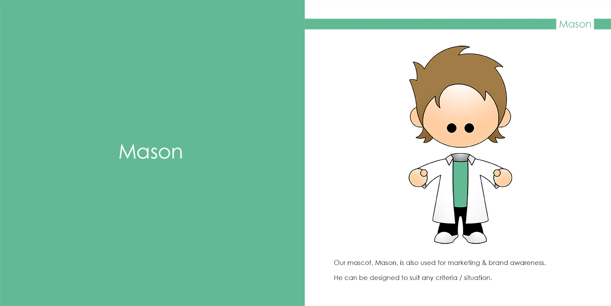
We accent our posts with a brand themed image to keep the brand consistency going. It’s probably simplified, minimalised and more than likely has a black outline with a green colour scheme. We design our accompanying images to reflect that of our brand. Stock imagery does not work for us. If we have to we can utilise our awesome mascot mason!
Our digital colleague and mascot…Mason!
Even from our early days we learned about placement in web design. Our logo is strategically placed in the top left corner, as, the blog says, you read left to right and it’s the first thing you see. Our website home page and internal pages all reflect our brand and logo. On any page, even without seeing the logo, we aim to assure the visitor you are on our site. The layout, the font and the images all associate with our brand. Everything has its reason and its place. This is also applied to our company literature.
All the above has enabled us to build brand consistency into our website design, social media presence and literature.
We make brilliant marketing simple by doing all the things you need to do right. Even reading the original blog we’ve based this on assures us we’re still on top of our game. This pleases us greatly! The industry is ever changing and ever evolving, so knowing we do things correctly (even sometimes without realising) makes all our reading, learning and applying this worth it.
Looking for a company that gets things right? We’re definitely up there we think!
All images are taken from our very own brand guidelines


