If you manage a Facebook page, you may (or may not) have noticed the cover image dimensions (photo or video) have changed.
We noticed the cover image dimensions have changed on our Facebook page and have been trying to figure out how it resizes from desktop to mobile. Very irregular especially on some phones. If anyone has been on our page – apologies for the mass of notifications about our cover image change. We were playing and testing but have come up with a solution. More importantly we’ve created a template to save you having to faff about trying to figure it out too.
There’s a .PSD file and a simple JPEG that you’ll be able to use to overlay and align your images onto.
Here they are, just click to download and away you go!
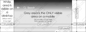
The main Facebook cover image dimensions for pages are 828 pixels wide by 315 pixels high.
However this is what it looks like on Sony Xperia XZ, but this isn’t typical as we’ve tried a few devices out.
Depending on the age of your mobile device throws up two variations. When viewed on a Sony Xperia XZ mobile, a section (off centred may we add) becomes the only visible part of the image. We’ve greyed out this section on the template. You may see that we’ve also added what we see when using a Sony Xperia – the search bar, a gradient and a top bar with your notifications / battery level etc is shown at the very top. We’ve included this so you are aware not to put anything you want being able to be read here as it’ll be obscured.
Notice the small cropped pill shaped element in the bottom right of the mobile-visible area? It is the new ‘Info and Ads’ button so watch out for the small amount it encroaches on here.

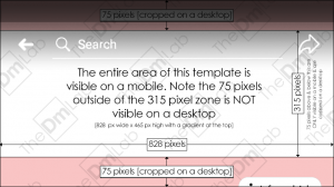
On newer mobile devices, the following template is what is probably deemed as current. It’s a slightly cropped image on a mobile as shown:
Please note the personal cover image dimensions differ slightly, but this is for page managers. Want a template for your cover image on their personal photo? Let us know and we’ll put one up!
We hope you find this useful, if anything we hope it saves you time. If you use the template or found this useful or have any pointers for us, please give us a shout.
Thanks!
EDIT: we’ve checked our Facebook page and pages we manage today, the 18th. It may appear that the changes we’re a glitch that have been fixed. On the Sony Xperia XZ there are now no issues with the off centred cropping. However the second layout we thought was for newer phones now appears to be a typical layout. One thing we have noticed is that on mobile devices the height of the cover can be incresed to 465 pixels high. The 315 pixel height is what is displayed on a desktop, this can be increased for a mobile to 465 pixels high. See the image below for an updated version…


![Facebook Cover Image Dimensions Template [Mobile & Desktop] July 2018](https://thedmlab.com/wp-content/uploads/2018/07/Facebook-Cover-Image-Dimensions-Template-Mobile-Desktop-July-2018-4-300x114.png)


