This may seem obvious, but all too often we see posts being published and it makes us cringe.
No, we’re not perfect, if we’re out and about we’ll upload a photo direct to social media from our mobile device that doesn’t always fit perfectly. However this is excusable. It’s when you see something posted that somebody has been bodged together. Worse still they’ve just found an image to post from the web. Yes, posts with images receive more engagement but do it right!
This was taken from Hubspot and you can see the full article here. It’s almost 2 years old but still relevant:
General Visual Content Statistics
37% of marketers said visual marketing was the most important form of content for their business, second only to blogging (38%). (Source)
74% of social media marketers use visual assets in their social media marketing, ahead of blogs (68%) and videos (60%). (Source)
More up to date statistics from Sprout Social state:
Tweets with images are 150% more likely to get Retweets than text-only Tweets.
Facebook still reigns as the most popular social media network with 79% of internet users in the US logging on the site.
Two reasons why you should up your game especially on these two platforms.
So, let’s start…
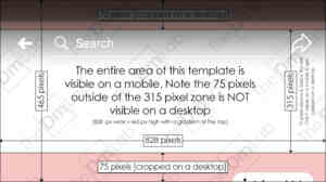
Use the template below to check that your cover image is correctly dimensioned.
Believe it or not, even verified accounts are still guilty of using incorrectly sized cover photos. If they have someone managing the social media accounts, one of the absolute basic thigs is getting this right.
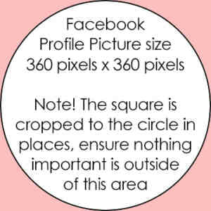
It’s worth noting as well that your Facebook profile picture is shown as a mixture of squared and circular. Below is a quick template to ensure that the important stuff in your square profile picture also works when cropped to a circle. You’ll note that on Facebook our square logo is without the black border – this is because we had to make it work for both – so avoid frames on Facebook if you can.
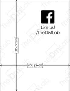
There are all sorts of acceptable sizes on Facebook that work but below is the size that we prefer to use. It takes up the whole of the screen on a mobile device. It is the optimal size for a mobile device but which also works on a desktop too. This is important because as of January this year, 95.1% of Facebook users used their mobile device to access the social media platform. https://www.statista.com/statistics/377808/distribution-of-facebook-users-by-device/ . On a desktop Facebook will fill the edges of a GiF or videos with the same dimensions as the template below with a blurry filler. This does NOT appear on a mobile though. It will appear to fill the screen in the feed and when clicked to view.
If you’re doing this already, great stuff! If you found it useful or used the templates or dimensions, give us a LIKE on Facebook and let us know!
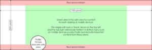
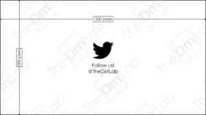
Twitter’s Header image is a very weird one. We’ve created our header image based on the template we created below. If you keep the main elements within the ‘safe zone’ you’ll be OK. Also watch out for the overlap of the profile image – it could cause you a headache or two!
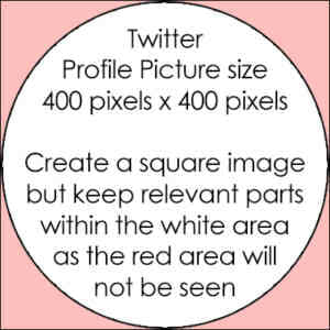
As we mentioned in the Facebook section – there’s a mix between squared and circular profile images. Twitter’s used to be square but is now circular. As this doesn’t change we’ve had to adapt our square ‘DM’ to a circular one for Twitter. Google+ also used a circular profile picture so it’s worth creating one to apply where applicable anyway.
How often do you click a tweet with an obscured / cropped accompanying image? We don’t that often. 80% of Twitter users use their mobile device to access the platform. This says to us it’s best to optimise for mobile devices and sacrifice the larger images a desktop feed displays and maybe save them for Facebook.
We’ve created the template below that we use, whether it’s an image of a GiF, it displays in full on a mobile Twitter feed. Videos tend to be OK if they are recorded in a landscape orientation.
If you’re doing this already, great stuff! If you found it useful or used the templates or dimensions, give us a FOLLOW on Twitter and let us know!

With Instagram, we like to keep the image square. We like neatness and uniformity. Doesn’t matter what size the square is but the bigger the better. We always crop an image square before uploading it. It’s primary a visual platform so anything goes really – we like to keep our image square so what you see in the profile feed (cropped squares) is what you see if they’re enlarged.
Use social media yourself to help with your marketing efforts? It’s best to do it right. With users accessing Facebook and Twitter on mobile devices it’s important that everything is geared and optimised toward mobile users. Desktop shouldn’t be neglected, but mobile sizes work just as well on desktop. Desktop optimised images do not translate as well on mobile devices.
We offer full social media management as a standalone service or as part of a digital marketing package. If you’d like to find out more click here.

