The right font, and a good font, is key to any good design. It needs to suit the design, compliment the theme of the design and also be legible. Festive designs often steer toward an old English, rustic look, where as sweets are often bold and bright. There’s no point in trying to be something it’s not, there’s no hiding! Products aimed at kids are clear and uncomplicated so there is no confusion in the supermarket between products. More up market products may opt for an italic font with waves and curves, sometimes trying to make something seem classier than it really is.
It’s obviously down to the designer’s discretion to use the best font, as in theory we should know what’s best. This call is often what separates a trained professional from a person with a graphic design hobby. As soon as I see ANYTHING with Comic Sans or WordArt I automatically put the designer in an amateur category. These people are enthusiastic, so you can’t knock them. At least they’re having a go.
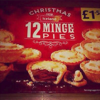
The reason that got me thinking about font design was the picture below I stumbled across on the web. I’m sure there are loads more but this made me laugh. It’s often a good idea to get a second opinion, something which wasn’t considered here. It did make us laugh though!