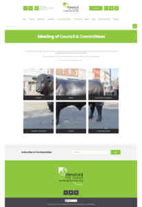
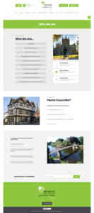
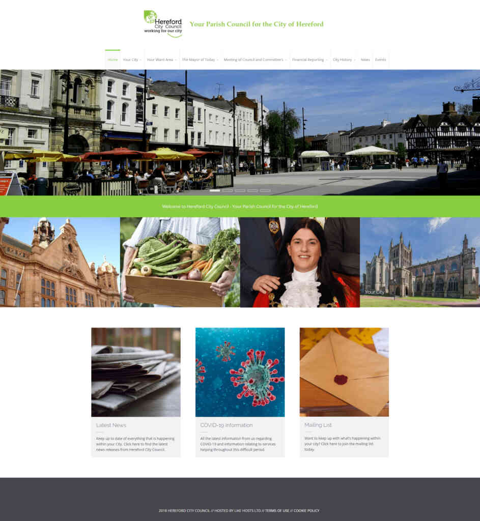
The DM Lab was given a fantastic opportunity to redevelop the Hereford City Council website.
Hereford City Council (the parish council – not to be confused with Herefordshire Council) are a fantastic organisation that have a genuine interest in bettering Herefordshire for its population. They don’t have the responsibility for delivering large and complex services like schools, hospitals and highways to its residents, but they play an important role in influencing others and acting as the voice of the people who live here. Potholes, parking and road layouts are the doings of the other council, not Hereford City Council.
They do some fantastic work that often goes unnoticed – so the redeveloped website will help paint a better picture of what Hereford City Council are achieving in and for our city.
There were several key aspects involved in the redevelopment:
Make it visually engaging.
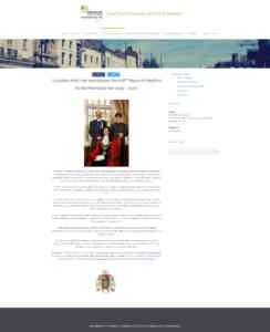
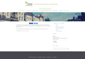
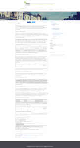
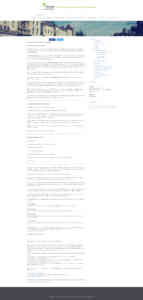
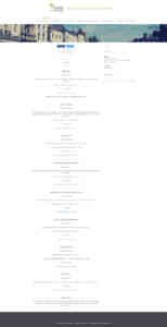
The current site suffered from a very generic page layout of content on the left, sidebar on the right. A lot of text – sometimes too much, and very few accompanying visuals. The pages, although informative – just weren’t engaging. Masses of text that scroll what seems like forever!
Make it accessible.
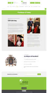
Something the old site lacked. Small fonts and masses of text meant some would have difficulty in reading and / or following. We chose a font that was easy on the eye, clear and concise. We chose Poppins as it covers all bases. Instead of lazily just replicating pages with a sidebar, we did away with this dated layout. Instead, the pages and content were deconstructed then rebuilt in a far more visually-pleasing, engaging manner.
We chose the ‘Poppins’ font as it is both easy on the eye and easy to read too. The text is clear and concise. We ensured it was easy to read and chose larger than usual font sizes so that nobody would struggle to read the text either on desktop or mobile device.
Highlight the positive work the Hereford City Council do.
We love our county – just as Hereford City Council do. We both want to shout about what a fantastic place this is to live. The incredible range of products and activities within it. Get the county recognised on a national scale.
Make it Informative.
The new website will act as both a historical cataloging and archiving of council meetings and as a tourist information hub. Above all, if visitors wanted to find out more about the county before visiting, this is the site they would use to plan their visit.
The site was extensively developed so that if you wanted to visit Hereford and had issue with your eyesight, you could still easily use the site. You can do this by adjusting the extensive accessibility settings to suit your personal needs. We even developed the site so that European (and further!) visitors could have the site instantly translated.
Make it Colourful.
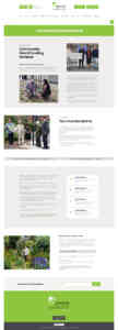
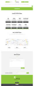
The Hereford City Council branding incorporates a lovely shade of green. We used this colour throughout the site as an accent colour and for easily identifiable call to action buttons. The key was to make the site visually appealing – which would further encourage engagement. The previous site was, for want of a better word, boring. Unengaging.
Original Home Page
However, this was something we addressed and then some!
Without going overboard, we made each page as interesting and as unique as we could. Something the old site suffered badly from was repetitiveness. Pages of scrolling text, a sidebar and the same header image that was used throughout the whole website. Not something we wanted to create with the new site. Visually appealing therefore engaging.
Optimising it.
The site is full of great, informative and engaging content. The site offers insights into the history of the city. Events, royal visitors and other significant goings-on. After developing each page, redesigning the layout to make it both interesting & digestible – we learned a lot! There’s so much information within the site that even we had only come across during the redevelopment. This is what we wanted the user to discover.
With all this quality content – we know exactly what to do with it.
The old site suffered badly from a lack of optimisation and thought after launching. With so much potential, it was time to address this. Websites should be seen as an asset to everyone who has one. The old site was just…’there’. Doing nothing really, which was a crying shame.
The Result.
We’re really pleased with how it looks. We’ve had several meetings with the team at Hereford City Council to ensure they get what they want while not compromising our efforts on the site. Between us we have created something that will add huge value to the HCC going forward.
With a comprehensive content management system, we will be showing HCC how to update and manage the site. It will continue to evolve. Furthermore, we’ve added online forms, an option to be able to donate directly to the Mayor’s charities. Overall, the site is worlds apart from the original. The HCC will be using the website as a valuable tool to promote their work and boost the appeal of Herefordshire as a whole with the addition of a comprehensive Tourist Information section.
Finally, we are extremely proud to be able to add the project to our portfolio.

